Space Industry
Organic geometry
Ephemersys is a 3-year-old startup founded by engineers, physicists and mathematicians. Them field is the space industry and the focus is a mission design tool developement for small satellites. One of the members member found me through a referral.
About the start
The subject of their inquiry was the UX and UI design of an application developed by them, but at the kickoff meeting it became clear that they also needed brand and strategic planning. Accordingly, we agreed and scheduled the project, which, divided into sprints and was completed in six months.
The strategy
As we started with the branding strategy workshop, in 3 weeks we defined all the pillars of the strategy and we created the baseline of the branding, which made a huge support for the future success of the startup and its product.
The name and the slogan
As conception dictated we went through the process of finding a name and slogan for the application itself to have its unique entity, meanwhile keeping related to Ephemersys.
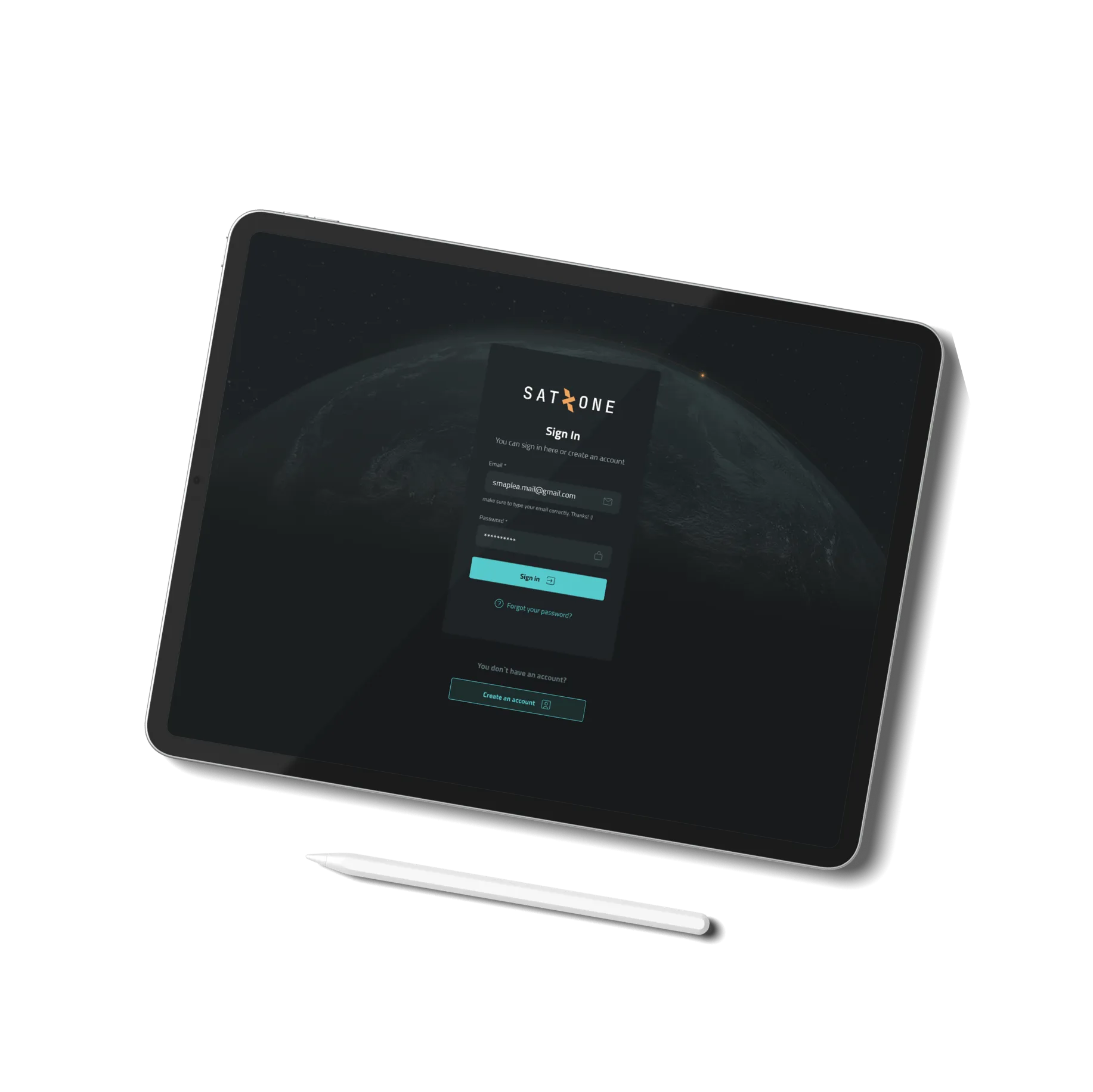
SATZONE
Name
Between various good choice, the final choice of the partner landed on satzone, which is referring to that level of the atmosphere, where all the satellites are located.
best scenario
Slogan
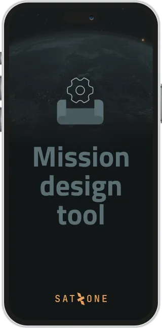
The application is a mission design tool, which provides the opportunity for the user to model the satellite hardware itself and its mission from A to Z, which called scenario in space industry. Since this is the most most advanced software at the moment, best scenario become the slogan.
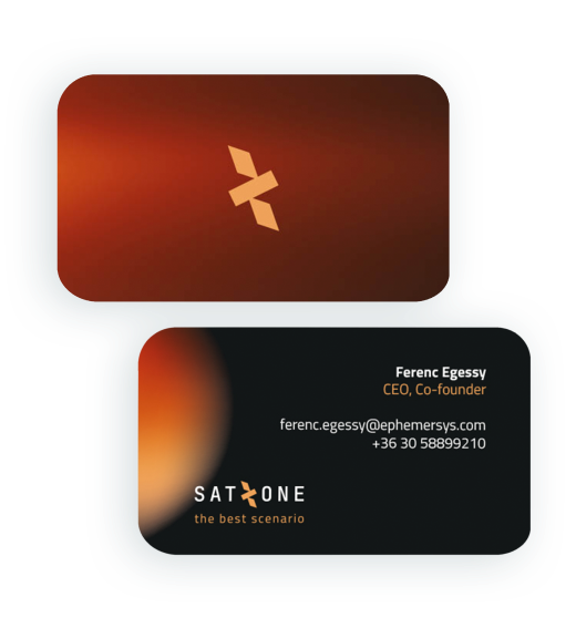
The logo and emblem
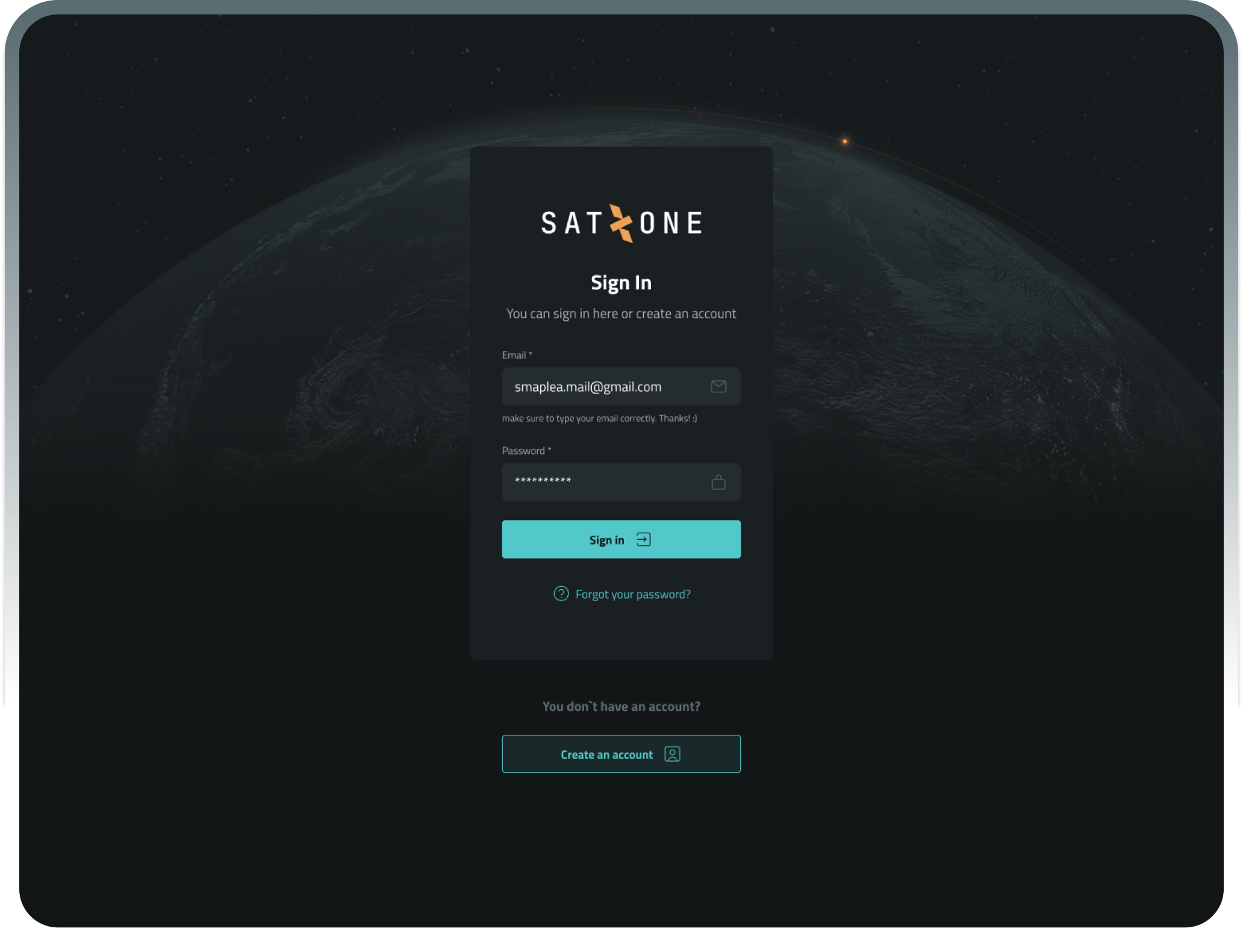
The primary appearance of the brand is dark mode, which refers to atmosphere in space, so the logo mainly appears and a bright colour.
In the logo the Z letter transformed into a flying satellite, which became an emblem.


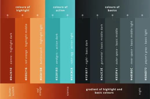
The colours
When we created the brand we wanted to have a toolkit to support the design system of an application. So the colours selected based to support the functionalities.
The typeface
Typeface had to be as functional as well characteristic, so Titillium Web was an excellent choice.

The assets
In the logo the Z letter transformed into a flying satellite, which became an emblem.
UX
During the branding process, the UX development was going on in parallel. The startup already had got the basic version of the application, however we had to rethink all the user journeys in the flow.
UI
Around the same time we finished with the strategy, brand and the complete UX. So the UI had all to start and let happen all the magic on the screens.
About Application
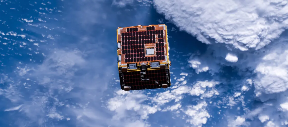
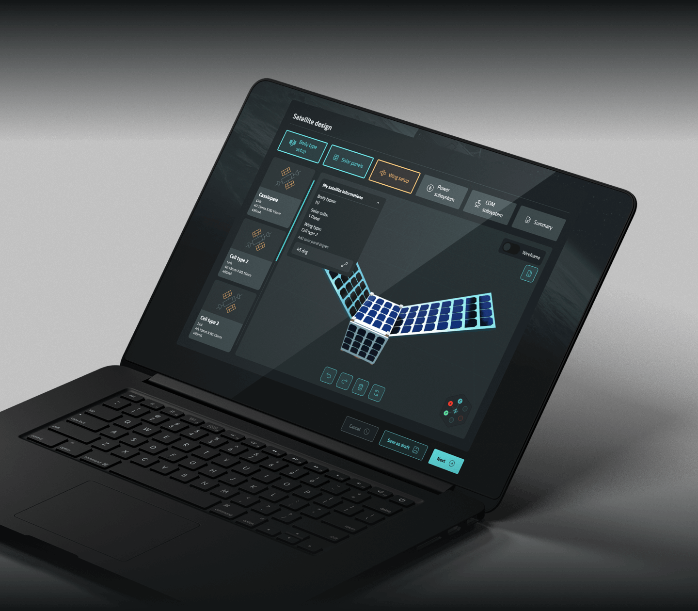
One of the speciality of this application is the user can build up step by step a small satellite in a real 3D modelling environment. It was a real challenge to create the design interface of modelling besides all the data driven surfaces.
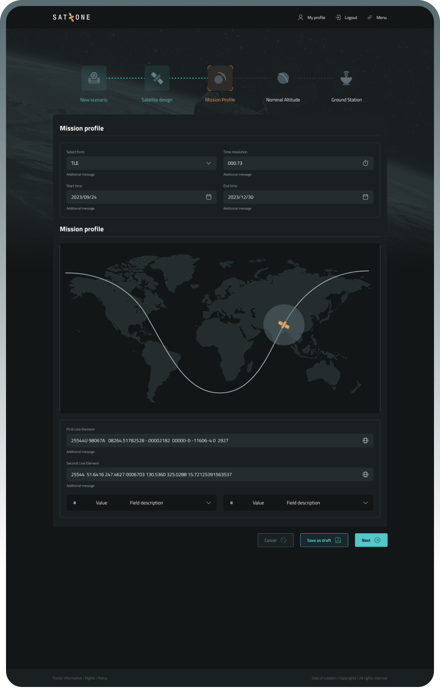
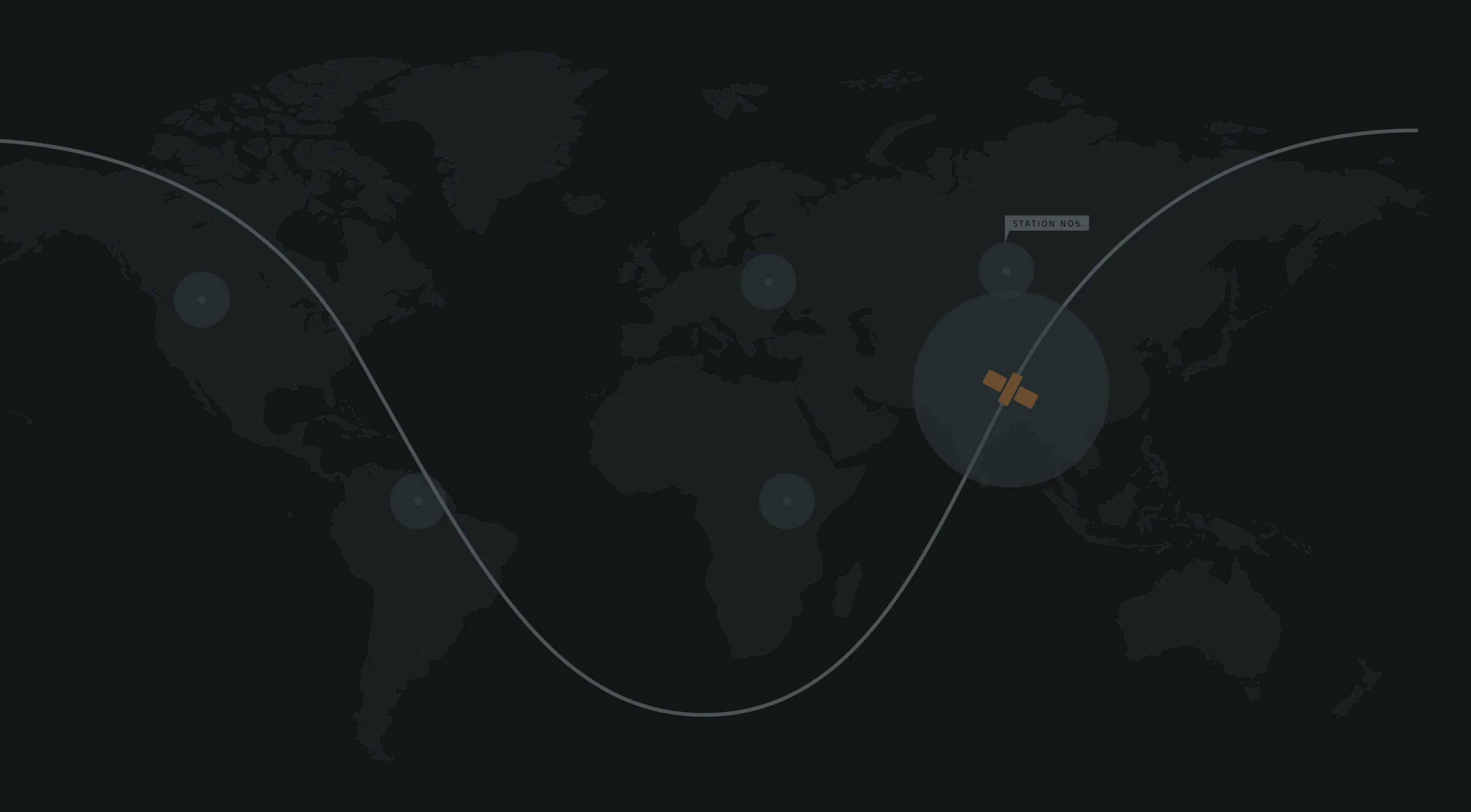
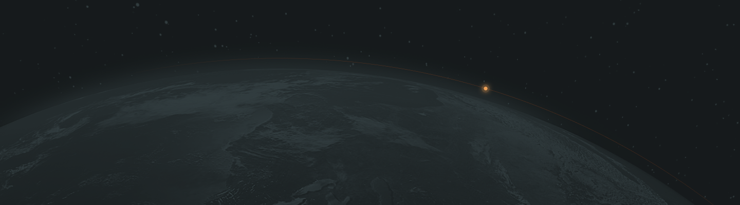
Orbit visualisation

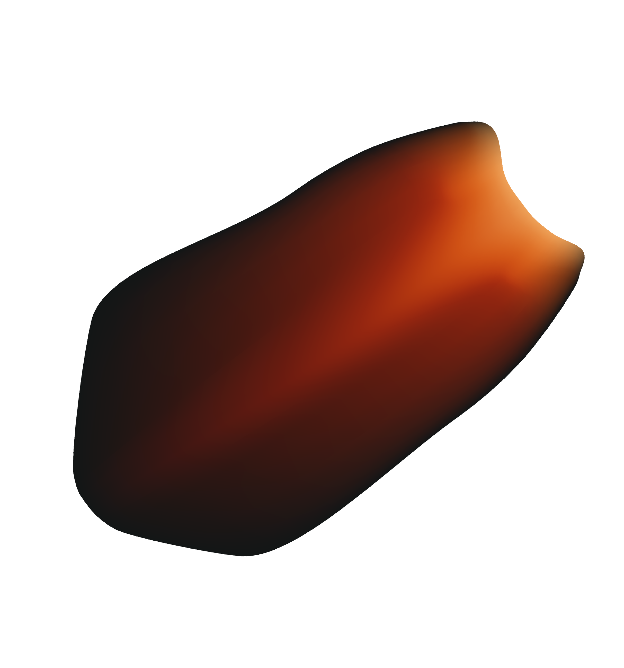
Radiation